As the title says, we are looking for a new logo for the DRC. We would to see what our members would like to see as our clubs new logo and therefore we are asking any and all members to submit their designs for our new logo. Graphically inclined or just want to take a stab at a new logo design? We want to hear from you! This is a chance to add your personal touch to the look of the club. Submissions must be in by 9pm Sunday December 7th. Please post your submissions in this thread.
Things to keep in mind when designing the logo are:
[ul][li]Must be a 1 or 2 color design, for ease of screen-printing on multiple medias.[/li]
[li]Simplicity is key… the logo must be able to be used as small as 1"x1" on letterhead, membercards, etc…[/li]
[li]Web banners and a logo are two different things. The logo we choose can be applied to a multitude of different web banners.[/li][/ul]
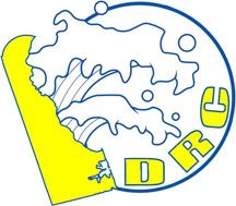
Some examples of a rough idea I previously put together are below:
FWIW, I have a 6 bulb DIY fixture over our tank. We run a good mix of differet wavelengths for 2 reasons:
I wanted to insure decent growth
I wanted it to look halfway decent
We use 2 10k bulbs, 1 6.5k bulb, 1 460nm actinic, and 2 420nm actinic. I am really happy with this color pattern as it gives some really nice colors but isnt to blue.
There all pretty good, but i think im leaning towards Andy’s. I like your first one with the club initials although when used in a color application i think i would change the letter colors to yellow. The colors are classic delaware. Its simple but not plain. I likes it a lot!
I like the idea and concept behind Andy’s, but I think it needs to be reworked a little. The current image just looks like 1990s clip art. Perhaps just a sharper image or different colors?
Ted’s is nice and clean and simple. Really like it. Perfect for a logo. Looks like a corporate logo. I’m worried about the copy rights to that photo in the splash image though…. I think I’ve seen it somewhere.
I had another idea I started to work on, but I don’t really have time to finish, nor do I really have decent software to do so currently on my PC. I probably got started on this train of thought when Andy was talking about the MTV logo. I knew I could do something with shaping corals into the DRC letters, but thought it would take too much time. Like the point Andy made with the MTV logo, which is simply the letters, the logo can change slightly through time and perhaps we could have a contest once a year to see if someone could rework the logo.
http://logoblink.com/wp-content/uploads/2007/12/mtv-logos-hats-wallpaper.jpg (Here’s the MTV logo for anyone that might be a little sheltered.)
Or you can just surf around www.mtv.com The logo changes on every page.
We could also have red, green, and white one for a Christmas theme or black and orange for Christmas……. If we make something simple and recognizable it would work well. The letters can be made into a one color cartoon font for simpler uses like T-shirt prints and hand outs. We would just need to keep consistent with the size and placement of the letters and possibly have a sweeping solid shape behind it to pull it together.
[center]
Note this is not a submition, just a thought someone can run with.[/center]
I was thinking somewhere along the lines of a mushroom and the state of Delaware for the letter “Dâ€ÂÂÂÂÂÂÂ.(or a fungia or montipora… many circular shapes we could use) I think it would be awesome if you changed the mushroom behind the state to either green to match or blue to look like water. Acanthastrea, Favites, or Favia all lend themselves to being photo shopped into any letter imaginable, so they could work for the letter “R”. I didn’t really work on this part at all. Hammer corals would be perfect for the letter “C”.
Just an idea, if you like it and are creative enough with photoshop run with it.
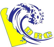
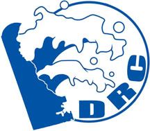
Two more tries… again these are rough copies… and am completely open for critique. The second one uses Craigs’ wave just reworked and simplified a bit. The one thing I disagree with Jon is your thoughts about reworking the logo yearly… that seems to completely go againt what we are trying to do with the logo IMO. Now changing the imagery in a banner to fit various season… holidays… etc., that’s one thing and maybe we could change the colors of the logo to fit… but completely reworking the logo yearly will never establish consistency.
I could not agree more about not changing the logo. It just doesnt make sense. Coke might change their can, but they never change their logo.
Wow Andy, you are really impressing me. I like this new one(on the top) as much as i liked the first one. I think a stylized wave is the way to go. I think the realistic wave is too much.
The more i look at this latest attempt and your first attempt i think i might like the newer one better. I think its the best by far. Is there any chance you could throw a couple of color variants up? I think keeping it two tone with gold and blue is the way to go, but maybe you can change the bule and yellow around, have the state and initials different colors, etc. I guess i dont have a good imagination.
What about the DE staying blue, the bottom portion of the wave blue, and the initials blue?
“The one thing I disagree with Jon is your thoughts about reworking the logo yearly”
I was just thinking using different corals or colors every year, but keeping it as “DRC” with the same size letters, placement, alignment, and perhaps background shape. Then if someone comes up with cleaner images or ones that came from their tanks unlike those which I stoll off Dr. Mac’s site we could change it. We will have new members in the future who can play around with this and even you may have more time to play with it in the future or will just randomly get an idea of something to try. Just like the MTV logo, the basic solid color design and lay out remain the same, just dress it up differently.
We are on the same page.
“Coke might change their can, but they never change their logo.” Yeah, but what about MTV,
or Nickelodeon? Do a google search for “Nickelodeon logo”. The font is just about always the same, but the shapes change.
The same sort of thing could be done with Andy’s as well. We could have an iced over wave for Christmas or throw in a turkey surfing the wave once a year on a splash page before you enter the website… The logo could also be made into a really graphically intense one for a splash image at the top of the site with satellite images and real wave and 3D chromed DRC. But most of the time when printed on small biz cards or on the corner of a black and white flier it would be made simple the way it was originally designed.
I just liked the cartoon shaped DRC because with other images like DVRC’s crab people could think of that website… of that club… can’t remember the name of it… the one with the crab as their logo. If we use just the DRC laid on in a specific manner it really represents us. Just thoughts at 3am.
Alright … after Andy’s last two posts, I think that my initial stabs were feeble - at best. At this point, I’m going to outright lie and say that I just put them up there to get the juices flowing …
The top one fraggin rocks with the outline wave rocks, and looks even better in monocolor.


