As for changing logos … take that discussion off this board gents. Let’s concentrate on getting entries now.
Sorry, took me a while to get to this post. When you get the time, visit this thread on Reef Central. The Grim Reefer has posted a dearth of info. The thread is about 35-36 pages long and still growing.
Or just follow icy’s example … lol.
Also … one recent post from that thread …
quote:
Originally posted by roushracer
I bought a Nova Extreme Pro, and it’s on it’s way but I think I want to replace the bulbs before I even set it up.
What bulb combo would you recommend to replicate radium HQI’s?
Here’s the catch, my shop only carries Giesemann and UVL bulbs.
Are any of the stock current bulbs worth keeping in there?
You got a shop in the springs stocking T5’s, cool. What’s the name?
I’d just replace all the stock lamps/
Front
Gmann Actinic Plus
GMann Midday
Gmann Actinic Plus
UVL 75/25
Gmann Actinic Plus
Gmann Aquablue
That is going to be bright but have a blue tint
See I like the bottom one better.
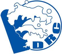
I think Jon is referring to RC where they modify their logo to give a thanksgiving or Christmas theme.
[quote=“4n4sd4, post:17, topic:896”]
Is this what you meant Shawn?
 [/quote]
I like this one a lot. can you remove the 2 upper most cirlces from the wave? Removes the “face” from the image. Or at least elongate them in to a water drop shape?
Maybe add a crab, scallop shell, or fish inside the DE image?
I’m still trying to learn how to use photoshop or I’d have more submissions myself, so in the meantime I’ll just make suggesions on the others’.
Ok in Blue That one looks better.
Actually, i was thinking just like that but with a yellow DE. However, ive got to agree with everyone else, the monotone is really nice.
I like the circles, it breaks it up with out being obnoxious. Its pretty obvious that Andy actually knows what he’s doing
We dont even have one logo yet, i dont think we need to be worried about preparing mutiple logos. I think keeping the same logo is ideal. We, unlike Mtv, do not have a world wide presence. I dont think changing the logo would do anything but harm. I think the concepts of logo and advertising art(i.e., banner) are getting confused again.
Andy, can you play around with a couple of two-tone options again? Maybe the exact same logo as above but with a yellow DE? or the exact same logo above but with a yellow “DRC”?
Thanks, that thread on RC has a lot of info.
The link that the little red house points to is really good also.
Jon, mine are a mix of giesman and 2 other brands… one for the 6.5k and one for the 460nm actinic. I got the 6.5k for reds and yellow colors as well as growth, and the 460nm actinic was more or less just to try it out and see what I thought. I am pretty sure from playing around with the bulbs that the 460 brings out some different corals better/worse than the 420, so I think im going to keep it in in the future.
[quote=“4n4sd4, post:17, topic:896”]
Is this what you meant Shawn?
 [/quote]
Maybe something along the lines of this one, only with DRC under delaware and the circle around the whole thing? The DRC curving up just seems kind of odd to me.
[quote=“Cdangel0, post:25, topic:896”]
can you remove the 2 upper most cirlces from the wave? Removes the “face” from the image. Or at least elongate them in to a water drop shape?[/quote]
I actually like the “face” … “faces” really. There’s a “baby face” on the lower wave.
[quote=“ronert, post:31, topic:896”]
[quote=“Cdangel0, post:25, topic:896”]
can you remove the 2 upper most cirlces from the wave? Removes the “face” from the image. Or at least elongate them in to a water drop shape?[/quote]
I actually like the “face” … “faces” really. There’s a “baby face” on the lower wave.[/quote]
It looks like a monster from Scooby Doo.
[quote=“Cdangel0, post:32, topic:896”]
It looks like a monster from Scooby Doo.[/quote]
lol
I would say you need a base logo. Plain simple not a lot of colors, works in black/white, goes on cards, shirts ect. This is the logo that gets carried with the club for awhile (obviously, you just spent $X to put it on shirts/cards!). Then you can make spin offs of the logo for everything else, especially web based objects. Hell change them everyday, does it matter? As long as the base logo is static somewhere at all times.
My 2 cents.
I like Andy’s latest. Nice, clean, professional, simple. All the things you’d want in a base logo. I would suggest we discuss want we really want in the base logo. The state shape, a wave, DRC, Delaware Reef Club. Then we can all (or just Andy since he seems to be doing good) work out different variations and pick the base logo from that. Then the doors are open for any logo/mod of the base logo/banner/ ect.
Ian give it a go.
"I would suggest we discuss want we really want in the base logo. The state shape, a wave, DRC, Delaware Reef Club. "
You got the right idea. Deadline for submissions is 9pm on Sunday!
Then you can make spin offs of the logo for everything else, especially web based objects. Hell change them everyday, does it matter?
Website? No. It doesnt really matter. However, i think keeping 1 Header somewhat consistent is a good idea. You can mod it for special occasions, but i feel consistency is important.
For all other media? It shouldnt change. The logo is our brand. When making letterhead, tshirts, etc etc, the logo should be consistent. If we were to do tshirts, the logo would be best on the front pocket area. The same logo everytime. When we put out additional tshirts, its the artwork on the back that we change.
I still like my wave better. Looks more like a wave and less like something from scooby doo.
I want to put a circle around it, but can’t seem to find the option with my current software.

Come on folks - deadline is almost here. Let’s see some other ideas.
I thought that Delaware city refinery is owned by Valero, not “SHELL” oil company. nice scallop shell though. we used to have to scrape tons of those things off the sea water heat exhangers at a west coast plant i worked at. they just get on the tube sheet and grow and cover all the tube openings.
Surf’s Up!
Any other submissions? Deadline is tomorrow!
Dooooh I’ll try to do something tonight…Warning, it will be Yuengling inspired.
Alright … last go
Large logo
Small Logo
Logo on banner


